
How to Make an Instagram Bio Easier to Read
Learn how to make your Instagram bio easier to read with simple formatting tips, clear spacing, stylish fonts, and better organization.
Your Instagram bio is often the first thing potential followers see, and it has just 150 characters to make an impact. A cluttered, hard-to-read bio drives people away before they even check your content. By using simple formatting techniques like line breaks, strategic emojis, and whitespace, you can transform your bio into a clear, scannable introduction that encourages followers and engagement with Fancy Fonts.
This guide walks you through practical methods to improve your bio's readability and make every character count.
Why Readability Matters for Your Instagram Bio
When someone discovers your profile, they spend seconds deciding whether to follow you. Your bio is their first text-based impression, and poor readability instantly signals disorganization or lack of professionalism.
A dense block of text forces viewers to work harder to find key information. They may miss your main message or contact details simply because everything blurs together. In contrast, a well-formatted bio lets visitors quickly understand who you are and what you offer. This reduced cognitive load increases the likelihood they'll hit follow or click your link.
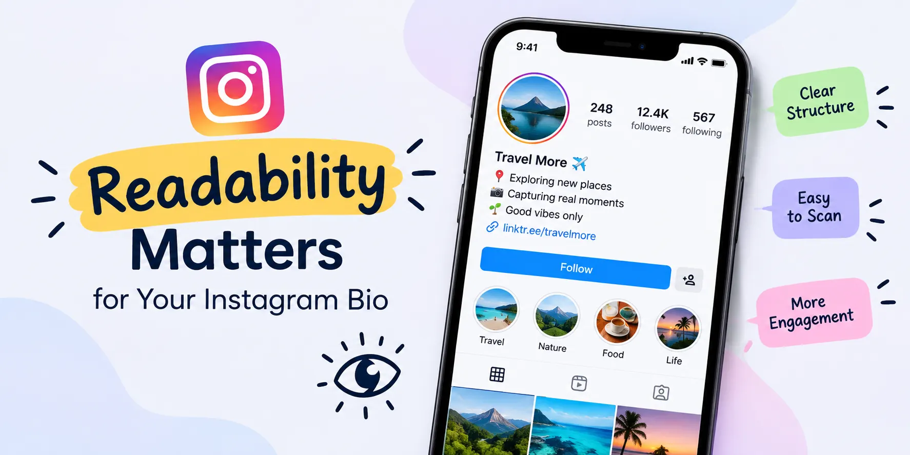
Mobile users comprise the vast majority of Instagram visitors, and on small screens, readability becomes even more critical. What looks manageable on desktop can feel overwhelming on mobile. Strategic formatting adapts to these viewing conditions and keeps your bio accessible across all devices.
How to Make an Instagram Bio Easier to Read
Use Line Breaks to Separate Information
Line breaks are the simplest yet most effective readability tool available. Instead of writing your bio as one continuous block of text, separate each piece of information onto its own line.
On mobile:
Open the Instagram app, go to your profile, tap "Edit profile," then click in the bio field. Press the spacebar and Enter together to create a line break. Some users report success pressing the Return key on notes apps and copying the formatted text to Instagram.
On desktop:
The web version has limited formatting options, but you can still use Enter to create breaks in most cases.
Without line breaks, readers must parse information like this:
Sarah | Graphic Designer | Coffee Lover | DM for inquiries
With line breaks, the same information becomes:
Sarah Graphic Designer Coffee Lover DM for inquiries
The formatted version instantly communicates hierarchy and lets viewers scan each element without mental strain.
Strategic Emoji Placement
Emojis add personality and visual interest to bios, but they work best when used purposefully. Random emoji overload clutters your bio and defeats the purpose of readability improvements.
Use one relevant emoji next to key elements to guide reader attention:
Location pin (📍) for your city or service area
Rocket (🚀) for growth-focused accounts
Coffee cup (☕) or camera (📸) for lifestyle/creative accounts
Link symbol (🔗) next to your URL
Star (⭐) for achievements or specialties
These small visual cues help categorize information without overwhelming the space. Emojis act as visual anchors that break up text and make scanning easier on the eye.
Avoid using multiple emojis in every line or copying emoji chains for decoration. The goal is clarity, not visual noise. Each emoji should earn its place by highlighting something important.
Master Whitespace and Visual Hierarchy
Whitespace is the invisible element that makes text breathable and pleasant to read. Strategic use of empty space signals organization and professionalism.
Place your most important information in the first two lines. Why? Some profile previews truncate longer bios, and viewers often don't scroll bio text. If someone sees only your first line and a half before deciding to follow, make sure it conveys your main message. Save less critical details for later lines.
Use symbols strategically to create visual dividers without using words:
| (pipe) between sections
(bullet) before list items
(dash) to separate categories
✨ (sparkle) for emphasis
These symbols create breathing room and guide eyes through information logically. They're especially helpful when you can't add traditional line breaks.
Group related information together. If you list multiple social platforms, keep them in one section. If you mention different services, organize them separately. Logical clustering helps readers understand relationships between pieces of information.
Organize Information Strategically
Effective bio structure follows a clear hierarchy. Start with identity, then purpose, then call to action.
For personal accounts:
• Name (if not already in username) • What you do/your passion • Location or key detail • Link or CTA
For business accounts:
• Business name (if needed) • What you offer • Target audience or specialty • Call to action (DM, link, shop)
For influencer/creator accounts:
• Your niche/specialty • What followers can expect • Collaboration info • Link to latest content
Don't waste characters on generic phrases like "Follow for more" or "Love this?" Be specific about what makes your account valuable. Readers need to understand your unique angle immediately.
Formatting Techniques and Special Characters
Beyond emojis and line breaks, special characters create visual structure within the 150-character limit.
Invisible characters:
Some creators use zero-width spaces or other invisible Unicode characters to force line breaks. While these work, they can be unreliable across devices. Stick with visible line breaks when possible.
Decorative dividers:
Symbols like arrow down, right arrow, or forward arrow point readers toward important information and add visual interest without taking up excessive space.
Section separators:
Use dashes, pipes, or dots to distinguish between different types of information.
For example:
Designer | 📍 NYC | Shop →
This format clearly separates profession from location from call to action.
Test your formatting in Instagram's mobile app before publishing. What looks good in a notes app might not render properly within Instagram's interface. Always preview on the actual platform.
Call-to-Action Placement
Your call to action tells followers what to do next. Whether it's "DM for rates," "Link in bio," or "Shop now," make it stand out.
Position your CTA where it's most likely to be seen. For most bios, this means the first two lines or the final line. Readers either scan top-to-bottom quickly or look at the beginning and end of text.
Use imperative verbs that create clear direction:
• "Visit →" (with arrow emoji) • "DM for details" • "Book a session" • "Check out my blog"
If you're directing people to a link, say "Link in bio" or something equally clear. Ambiguous CTAs like "See below" assume readers will scroll through your entire bio, which many won't do.
Testing Across Devices
Readability doesn't matter if your bio looks different on mobile versus desktop. Always test your formatted bio across devices before considering it final.
View your profile on your phone and a desktop or tablet. Pay attention to text truncation. Does your most important information remain visible, or does it cut off? On mobile, less text appears before a "more" prompt, so ensure key details stay visible above that line.
Check that emojis render properly on both platforms. Occasionally, emoji appearance changes between devices. Test links to confirm they're clickable and lead to the correct destination. Confirm that line breaks display consistently and don't create unexpected gaps or formatting issues.
Common Readability Mistakes to Avoid
Even well-intentioned bios can undermine readability through small errors:
Using all caps: Feels like shouting and exhausts readers' eyes
Excessive punctuation: Multiple exclamation marks or question marks create visual chaos
Too many special characters: Overusing symbols negates their benefit as visual anchors
Unclear abbreviations: If you use acronyms, ensure they're industry-standard or universally understood
Outdated information: A bio that lists old contact info or inactive links erodes trust
No separation between ideas: Dense paragraphs defeat the purpose of readability work
Inconsistent formatting: Mixing styles confuses readers about information hierarchy
Review your bio regularly As your focus or contact info changes, update it. A stale bio signals an inactive account.
Conclusion
A readable Instagram bio doesn't require complex skills or tools. Simple formatting choices like line breaks, strategic emojis, and thoughtful whitespace transform a cluttered bio into a clear, scannable introduction. These techniques take minutes to implement but significantly impact how new visitors perceive your account.
Test your bio on mobile, keep information organized, and update it regularly as your goals evolve. When your bio clearly communicates who you are and what you offer, followers naturally follow.